Designing Effective Warning Labels

(74156)
To make your signs and labels as effective as possible, follow these hints. Click on the headings.
sg ansi hint1
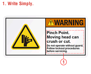
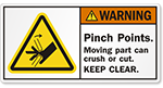
Explain the hazard directly and simply. Many people cannot read above a 6th grade level. Avoid " weasel words" such as "Moving head can be dangerous" or “Use guard as needed". Avoid adverbs, such as "quickly" or "sometimes" or "carefully". Be specific, instead. Exact instructions mean a safer environment. Flush left text is more legible, especially for longer messages.
A pictogram symbol conveys, at a glance to even those that do not read English well, the particular danger or the avoidance procedure. Professional pictograms show that the hazard is serious.
This is the headline that gets the viewer’s attention. Scale the signal word to the probability and severity of the hazard.
Exactly what do you need to do to not get hurt? And, to make this action-oriented avoidance statement credible, tell what will happen if you don't follow these instructions (for example, "death or serious injury").
A life can be on the line. Don’t compromise you message with a label that does not last. Make sure the label has rounded corners that resist flagging and a lamination that resists chemicals and weather. The cost of the label is usually a fraction of the cost to install it – so, it only makes sense to purchase the most durable label possible.

Let's dig deeper into warning label design. Click on the links below for some Insider’s Tips with detailed instructions on how to design warning labels that are truly effective.