Warning Label Symbols

Warning Labels with a Symbol

Safety label symbols can provide a powerful means of communication - but they can also be overused. Safety symbols, on their own, can also be perplexing . They need "context" and, most often, reinforcing text. This guide helps you avoid the most common pitfalls in choosing a symbol - and explains how to use warning label symbol effectively.

Use of Symbol Labels Alone

Can we use a symbol by itself? Many symbols, in isolation, are not understood. A symbol, itself, does not mean your warning is adequate. Too many times, symbols are used without thought – as if a symbol alone lets you off the hook. "I have done my job and have given adeguate warning."

In one tragic international case, the classic skull and crossbones symbol (see below) did not mean “poison” for the targeted audience (poor Iraqi farmers). To these farmers the symbol, if anything, meant that this wheat seed was specially powerful – and not laced with poisonous fungicide. The result was over 400 deaths after farmers unsuspectingly ate the wheat.


Reinforcing text and, mainly, training is necessary. Abstract symbols, especially, are subject to misinterpretation. Literal symbols, in contrast, can become cartoonish and too singular in their depiction of a hazard.
Abstract Symbols

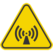
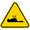
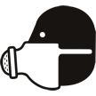
No Pacemaker at Risk Symbol Do Not Enter Symbol RF Symbol Cancer Symbol Canary in the mine symbol
Literal / Representative Symbols
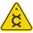
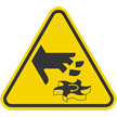
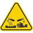
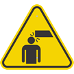
Rotating Blade Symbol Corrosive Symbol Rotating Shaft Symbol Watch Your Head Symbol Blood and Guts Symbol
Abstract symbols take time to learn. On the other hand, the exaggerations implicit in a literal symbol can make that symbol look cartoonish – hence easy to ignore as not being "real". The “blood and guts” of the last symbol (above right) is boorish to some, which, in turn, invites apathy. Research on explicit cigarette warning labels, however, leads to the opposite conclusion: a gruesome and graphic depiction of the dangers does work – at least to the demographic of smokers. As these examples as well as the tragic case of the poison symbol noted above attests, the context and the intended audience are the ultimate factors in gauging the effectiveness of a symbol.

Symbols, though, can be exceptionally powerful and immediate. So, do not be afraid to use them. Symbols are rarely perfect. Just know your audience and, in most cases, reinforce the symbol with text and training.

Symbol Consistency

In theory, a family of similar-looking symbols is best. In practice, symbols are rarely have consistent look. The goal of a consistent look to your warning label symbols to isolate a particular danger or activity. In the blue symbols below, the head is the same – to allow you focus on the differences (e.g. in one case wear goggles, in another wear a full face shield). Inconsistent symbols make these distinctions in meaning harder to decipher.

Consistent Symbols
Wear Goggles with side Shield Symbol Wear Ear Mask Symbol Wear Hard Hat Symbol Wear Face Shield Symbol Wear Dust Mask Symbol
Inconsistent Symbols
Wear Respirator Symbol Wear Dust Mask Symbol Wear Eye Protection Symbol
The symbol below left, which insiders alternatively call “Mens Room Man” or "Helvetica Man" because of its ubiquity, is an ideal template for hazard warnings.
Helvetica Man Watch for Cars Symbol Crush Man Symbol Shock Man Symbol Drowning Hazard Symbol Poisoned Man Symbol
This “Mens” Room man has been has been hit, burned and poisoned more than a Hollywood stunt man – but he keeps on coming back for more. He is a familiar and consistent actor upon which we project all sorts of hazards. We are empathetic with his plight, yet learn to avoid his mistakes.

Prohibition Red Slash on Top

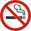
Generally, the red slash should be placed on top of the black symbol. The ubiquitous No Smoking Symbol is a good example.

No Smoking Symbol with Red Slash on Top

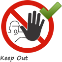
But, like most rules, there are exceptions. Professional label designers will often sacrifice this “rule of thumb” when vital graphic information is obscured by placing the red slash on top of the black graphic symbol. Some common examples are the common "Keep Out" or the “Not a Lift Point” symbol below.

Keep Out Symbol

Not Lift with Hook Symbol
In practice, the subtlety of whether the red slash is on the top or below a symbol is often lost on the viewer – in favor of the larger gestalt of what the symbol really means.

Warning Labels with Multiple Symbols

A label that has lots of symbols is not always more effective. Theoretically, a string of symbols can be read like a book. In theory symbols create their own vernacular. In practice, though, multiple symbol labels often confounds the uninitiated.
Warning Label with Multiple Symbols

Should the Symbol on Left or Right?

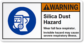
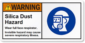
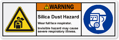
One of the most common label formats is the horizontal layout – with the symbol either on the left or on the right of the text. Two common designs based on the ANSI Z535.4 standard are shown below.
Silica Dust Hazard Label with Symbol on LeftWarning Labels with Symbol on Right
Although both design variations are allowed, most label designers favor the design with the symbol on the left. This allows the symbol to be seen first, with the text then on the right. For western cultures, this makes sense; you read from left to right. The symbol gets your attention (like an illustration in a book) and then the explanatory text (like a caption to the illustration or figure) follows.

For a label with two or more symbols, which should come first?

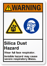
We recommend putting the hazard first, followed by the symbol showing how to elude or avoid the hazard. In the examples below, the label describes the hazard (airborne dust) and then the prevention measure (a full face respirator). The text also follows the same paralled structure: the hazard is followed by the prevention instruction. In cases where your text first covers the prevention instruction, the symbol order can follow this alternative sequence.
Multiple Symbol Warning LabelSilica Dust Warning with Multiple Symbols